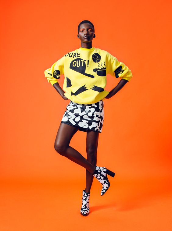
If fashion is a language, colour is one of its main means of expression. It is the first factor to which we respond. It grabs our attention and sends a message that can alter our perception of a product. It can change our moods, the way we feel about ourselves or how others respond to us. We create our identity and the use of colours has always a special meaning.
In the late 1800s French textile mills began to issue colour cards, swatched with paper or ribbon samples (they showed what colours were in vogue amongst the Paris dressmakers) and were popular with US manufacturers and retailers catering to a new mass market. By 19th century early women's magazines increased awareness of colour and fashion trends via colour sketches and plates, which had an important role as fashion advisors.
With the proliferation of fashion photography in the early 20th century, a new type of journalism- the fashion magazine- made this info more widely available. So called leading fashion magazines created fabric departments with fabric editors who researched the markets, attended the textile trade shows, created colour and fabric trend presentations and consulted with designers to advise them of upcoming trends. Because of lower-cost producers in Asia, fabric and fibre companies were forced out of business, but we can say that this type of fashion press entered forecasting.
Colour forecasting is the process of predicting the probable colour and trend directions for fashion and related consumer products. It requires a healthy dose of inspiration and intuition. The creative part of us puts colours together in a way that is pleasing to the eye and speaks to the viewer, Our perceptions in the natural world rely on internal memory and trigger responses that are innate and universal. Blue skies or green grass are cheerful and calming, while yellow/back stripes, darkgrey and red indicate danger.
As Diana Vreeland once said: "Pink is the navy blue of India", our understanding of communication using colour are also a result of our cultural learnings. In general, colour evolution reflects cultural and societal changes. The past decades increased awareness of climate change and the need to preserve natural resources has driven an increase in the preference for blue and green - the colour of air, water and nature. Another good example is the economic crisis of 2008/2009 which increased a big demand for gold and silver colours.
The colour forecaster must analyse and interpret colour in context of societal changes in order to predict consumer colour preferences in advance of selling season. His true skill lies in identifying a trend early in its development, then making the connection between an emerging trend and the wants and the needs of the consumer two years down the road and translating those wants and needs into colour preferences.
During 1920s, colour became a marketing tool. The British Colour Council helped to forecast and set colour standards for textile manufactures and suppliers. Its "Dictionary of Colour Standards" defined colour by hue, tone and intensity. Colour forecaster's clients- brands and retailers have come to realize that different market segments respond to different colours. The main point is to make an unique colour story which forms their own identity (Louboutin's red, Hilfiger's tricolor of red, white and blue or Hermés's orange). Designers, brands and retailers now have many options for colour forecasting. They may purchase or subscribe to the services of various trend bureaux such as Promostyl, Peclers Paris or Carlin International. Some services provide paper tabs or numbered references from Pantone, Scotdic, CAUS, etc. Today colour forecasting is evolving away from the concept of "one trend fits all" and returning to more specialized trend stories.
Catwalks are important shows for directions in silhouette, colour and fabric and for colour trends in accessories and beauty. The major fashion weeks held in New York, London, Paris and Milan are staged six months ahead of selling season. Live streaming of Fashion Weeks on the internet may shorten the colour cycles, circumventing fashion magazines and retailers by providing the consumer with the latest information.
And what are the top colours for Fall 2017?
Colour Palette for New York
GRENADINE
TAWNY PORT
BALLET SLIPPER
BUTTERUM
NAVY PEONY
NEUTRAL GRAY
SHAPED SPRUCE
GOLDEN LIME
MARINA
AUTUMN MAPLE
Colour Palette for London


No comments